The 2019 WNBA rebrand, including the new WNBA logo, was years in the making. At that time, the WNBA was finally seen as a league of its own, with an audience potentially different from that of the NBA’s. And, as a result, it was clear there was a need for entirely separate marketing for the league to make its own mark. But it wasn’t always that way.
The way people tended to think about the WNBA previously, is the way they think about siblings. Basically, the NBA was the older brother that went to school first. While the younger sister, the WNBA, was left to walk in his foot steps.
The teachers all expected the WNBA to be like the NBA. And they couldn’t help but compare them. But in reality, each child (and league) is dramatically different. Each league has different goals, players, and fans. Therefore, the comparison, while tempting, isn’t all that apt.
The WNBA should be compared to her peers: the National Women’s Soccer League, National Pro Fastpitch, and the National Women’s Hockey League. And when seen in that light, the WNBA is the longest standing professional women’s sports league in the U.S. The WNBA needed a unique look and feel, while acknowledging its heritage.
Furthermore, for over two decades the league – comprised of a majority of Black women – had brought diversity to screens of all sizes. So it had stood for inclusion and equality in practice. But not in spreading that message externally.
Cathy Engelbert, the commissioner of the WNBA, readily shared she knew “[They] ha[d] a marketing problem.” Which the league put effort into addressing over the last handful of years. Cue the WNBA rebrand and an improved WNBA salary.
So today, we’ll explore the WNBA’s latest rebrand (you can get a WNBA logo sticker here and here in pride colors), and its target audience. As well as take a look at how the WNBA logo has evolved – including the old WNBA logo and the new WNBA logo – and who it might be! Plus, find out the name of the color that makes today’s WNBA Orange Hoodies pop. Finally, we’ll reveal whether the rebrand worked.
The WNBA has rebranded twice since 1997. The first refresh launched in 2013 with a goal of better exemplifying the state of the women’s game at the time. And the second rebrand debuted in 2019 to appeal to socially-conscious millennials. Excitingly, for this evolution, the players had a voice in the brand’s presentation. So here we’ll take a look at how the rebrands came to be, and changed the game forever.
Discussing a rebrand is meaningless if you don’t know what the brand even is to begin with. So let’s start there. The WNBA’s meaning is: the Women’s National Basketball Association. It’s a professional women’s basketball league in the United States founded on April 24, 1996 – with the first season beginning in 1997.
Today the league consists of 12 teams: six in each conference, with conferences divided between the Eastern Conference and the Western Conference. Excitingly, the 2021 season is the 25th in league history.
And as you can imagine, it’s taken a lot for the league to stay relevant throughout the years. Plus, a lot has changed – rules, players, viewership, and so on. So in 2019, the league realized a refresh was essential to their future growth.
By 2019, the WNBA knew they needed to better exemplify their core ethos externally, while also being more culturally relevant. This problem prompted “a comprehensive look at the entire business” according to Christy Hedgpeth, the WNBA’s Chief Operating Officer. Roman King, the Creative Director of the WNBA, led the way during the rebrand, and has recently been named to Hashtag Sports’ inaugural Creators of Color cohort.
Their analysis revealed the game needed to be marketed differently: by targeting 16-to-34 year old millennials, and even women. Not surprisingly, this millennial demographic was essentially identical to the league’s biggest asset: their own players.
“The younger, hipper, cooler, very socially conscious consumer is desirable. Because they are setting the pace of culture – the trends around music, fashion, etc. And that’s really who our players are.” said Christy.
As a result, the league worked with Sylvain Labs on a refreshed vibe that would put the players at its core. “It’s really about who our players are, first and foremost,” Christy said. “We think about how the players have been at the forefront of a lot of conversations around women and culture. And they’ve been leading the conversation in a lot of ways.”
Shortly thereafter, the WNBA announced their brand refresh on Twitter, which soon debuted along with the 2019 WNBA Draft. Though the full roll out didn’t take effect until the start of the 2020 season. When the new jerseys with the AT&T logos were finally available during the 2020 WNBA Draft.
However the jerseys weren’t the only updated look. The brand update also included:
Of course, merchandise for fans was central to the WNBA’s strategy. As Christy articulated, “You can’t be culturally relevant without having cool stuff to wear. So we’re excited to build on our merchandise and work with our partners to reflect the brand in a lot of cool and exciting ways.” In fact, updated merchandise was available for purchase even before the logo hit the WNBA uniforms.
Also, because of the rebrand’s new multi-year partnership with AT&T, the AT&T logo was featured on the front of all the teams’ jerseys. Which was a huge first: giving AT&T an exclusive promotional slot only apparel companies had held to date. Also, the company was the prime sponsor of the WNBA All-Star Game in 2019. And, collaborated with the WNBA to create new programming showcasing women in sports.
The latest WNBA rebrand changed the story about women in sports in a big way:
“The WNBA is reasserting itself as a bold, progressive league that stands for the power of women,” Christy said. “This new voice will amplify our mission of empowerment and inspiration and will magnify what makes our league exceptional – the strength, diversity and multi-dimensionality of the women of the W.”
To celebrate the historical 25th season, the WNBA went even further, rolling out a new campaign, Count It, and a distinguishing and purposeful 25th season logo which is displayed on the courts, jerseys and game ball. The WNBA and Nike also collaborated to unveil clutch new WNBA jerseys.
Critically, players had input into the brand new designs, both in terms of fit and look. And the new WNBA uniform system features three game uniform editions for each of the 12 teams in the league, bringing stories from their cities and communities to life through the muse of female archetypes in storytelling and film.
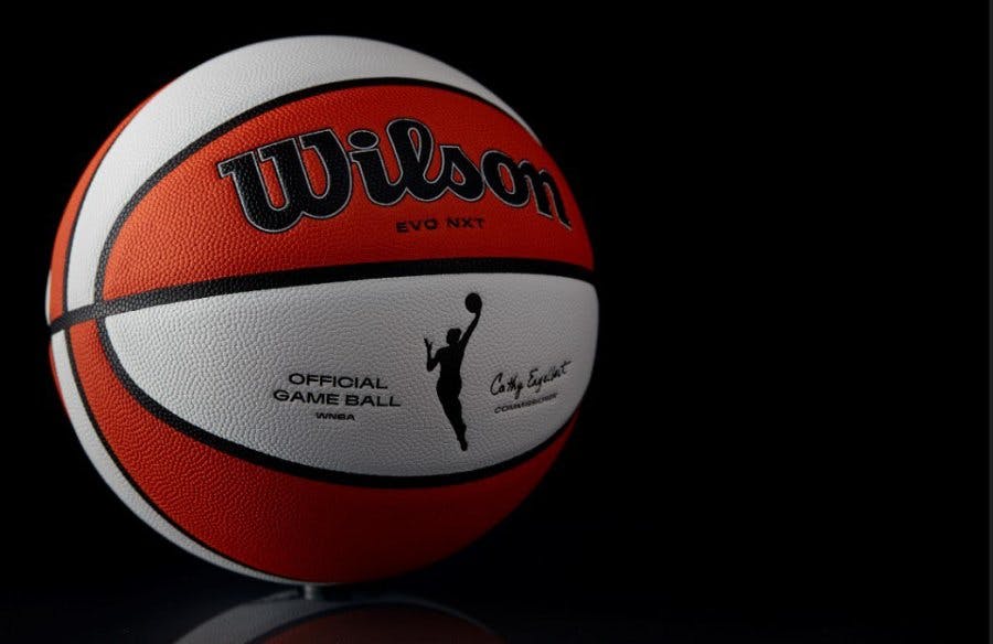
Additionally, the official Wilson WNBA game ball ushered in a new chapter for the league with a fresh look.
So now that you know where the WNBA landed, here’s what it took to arrive at the “fire” we get to enjoy.
The WNBA logo has evolved dramatically over time. Here we’ll explore the design twists and the purpose behind each update, with a quick trip down memory lane.
When the WNBA launched in 1997, their first logo was basically a female version of the Jerry West-inspired NBA logo. The WNBA logo consisted of a red, white, and blue shield. And it featured a female player (Logowoman) with hair worn down, but above her shoulders, dribbling a ball. Though it wasn’t thought to be the figure of a specific female athlete in the league.
The WNBA updated their logo again before the 2013 season. At that time, the goal of the rebrand was to reflect how the level of play had changed since 1997. Essentially, they wanted to better encapsulate the diversity, athleticism, and competitive nature of the current game.
As a result, the cornerstone of the new WNBA visual identity was a more modern Logowoman silhouette. This time, it featured a female player with a ponytail hitting a layup. There was speculation that it was modeled after Sue Bird.
Furthermore, the shield’s edges were rounded out to a more rectangular shape. And the background color for the shield was turned orange, to reflect the signature orange-and-oatmeal color scheme of the game ball.
This logo was rolled out on uniforms for the 2014 season in conjunction with adidas. And there was even an extensive social media campaign surrounding the Logowoman.
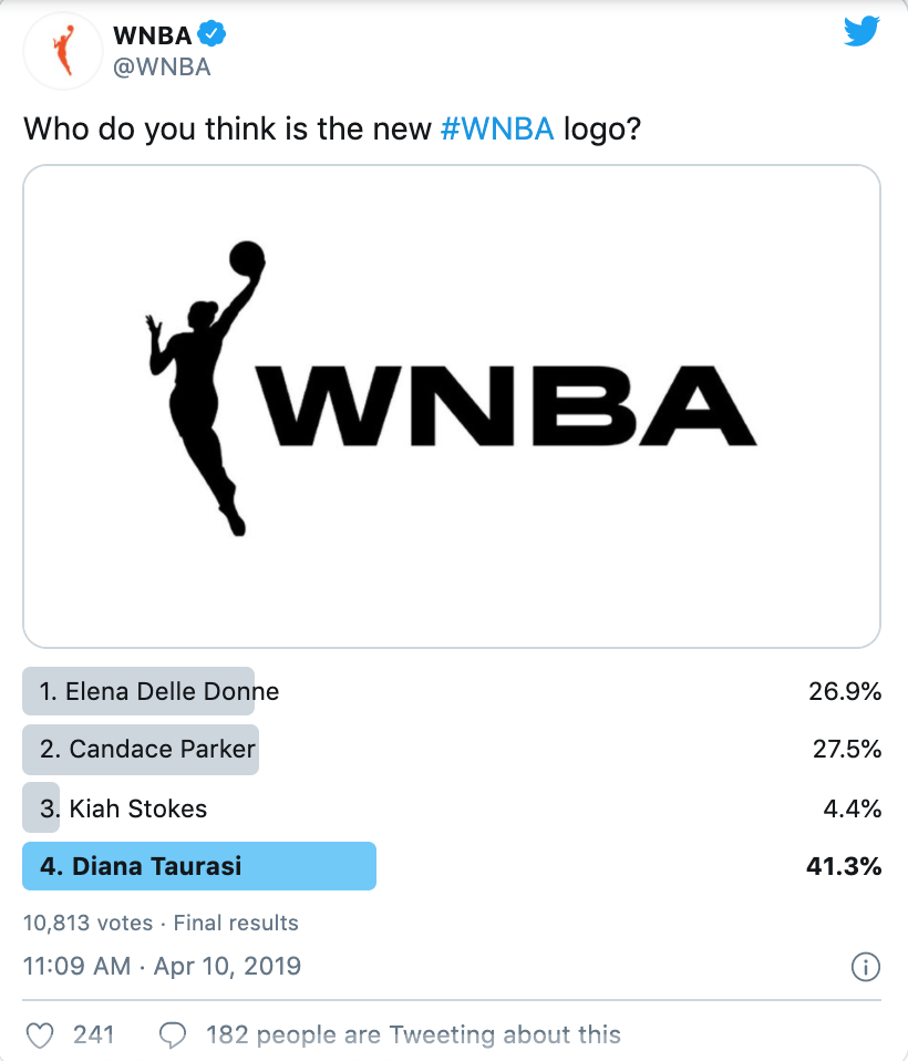
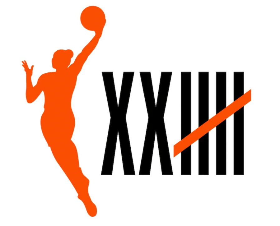
The newest WNBA logo breaks beyond the barriers. Which is was fitting, because it was created with the goal of amplifying the WNBA’s mission of empowerment and inspiration. It also had the goal of highlighting the strength, diversity, and multi-dimensionality of the league’s current players. While the new logo is not based on any player or group of players, it was created with with widespread player input.
The resulting logo is phenomenal. It encourages players to play outside the box. And fans to think outside the box. That’s right, the Logowoman has at long last broken free.
“They took the silhouette out of the box which is a massive breakthrough as she was perceived totally different,” WNBA chief operating officer Christy Hedgpeth said.
“She was free, there was more movement there, taking up more space. She’s more athletic, longer physique. This is basketball on our terms. That was a phrase that really resonated with the players. That’s really symbolic in that regard.”
This is actually a really big break from tradition. There’s a rectangle around the NBA logo. Same with the G-League logo. And same for the previous W-logo. By taking the box away, the rebrand feels more powerful, freeing, and expansive.
Hedgpeth insists that the new logo wasn’t modeled after one player. Though many viewers thought it was Diana Taurasi.
As you might suspect, the hair was a huge part of the conversation. The new logo has a bun which represents the way many players of all races wear their hair.
In the newest version, the Logowoman also showcases a sleeker, more modern movement – finger-rolling, laying up the ball. Plus, the updated logo places the silhouette on its own next to the updated wordmark. And also provides the option to solely use the silhouette alone.
The WNBA’s new primary color palette still involves orange. But it’s now black, white, and a specific shade of orange called “Fire.”
To celebrate the league’s 25 seasons of storied history, a new logo was debuted featuring the now classic hooper with a bun, plus ‘twenty five’ in roman numerals plus a strike through as the fifth line indicating the ‘count.’
“We are thrilled to launch a new narrative around the upcoming WNBA season that is rooted in defying expectations and excelling in the face of adversity,” said Phil Cook, WNBA Chief Marketing Officer.
“The WNBA’s 25th Season logo signifies that the league isn’t done ‘Counting’ achievements because there are countless more to come. The WNBA is on the rise and we’re excited to bring fans along the journey through a monumental season for the league and for the seasons ahead.”
WNBA Commissioner Cathy Engelbert emphasized, “We are celebrating a quarter of a century of the impact the WNBA has made on sports and society, and on generations of young and diverse athletes.”
Also, check out the history of previous WNBA anniversary logos to see how this one stacks up.
Beyond the new silhouette, new typefaces were also created for the WNBA logo in 2019. Production Type and Hélène Marian were commissioned by Sylvain Labs to create a new wordmark. Plus, they also made the WNBA a custom family of typefaces.
Now the WNBA has a roster of 13 diverse and stunning typefaces that fit with the league’s inclusive, forward-thinking ambitions. Just to highlight a few:
So was the hard work of updating tons of assets to be more culturally relevant worth it? One hundred percent.
One standout aspect of the rebrand was the #OrangeHoodie, which tons of NBA players wore to promote the WNBA 2020 season’s start. Players including LeBron James, Chris Paul, Damian Lillard, P.J. Tucker, Victor Oladipo, Devin Booker, and C.J. McCollum sported the look.
It should come as no surprise that NBA players are big fans of the WNBA. Kobe Bryant was frequently spotted court side with his daughter Gianna. And Devin Booker kindly refers to the league as his “sisterhood”.
Devin told GQ, “Ever since I’ve been in Phoenix I’ve made it a point to support the [Phoenix] Mercury players and support the WNBA as a whole. A lot of the things they do go unrecognized and they need the treatment they deserve. I’m inspired by them, which made it easy to wear the hoodie and give them the support they deserve.”
After NBA players shared selfies of themselves in the WNBA hoodie, it started selling like hotcakes. The retailer Fanatics – who is partnered with every major sports league in the U.S. – reported that The WNBA hoodie was the top-selling item across their whole site during that time. And today, the orange hoodie is the best-selling WNBA item ever.
But the rebrand’s love didn’t stop there. Lil Wayne, New Orleans Saints’ Michael Thomas, and rising tennis star Naomi Osaka all shared images of themselves in the WNBA hoodie, too.
And while increased apparel sales are certainly a win, the even bigger payoff of the rebrand came in the form of a different number. The 2020 season’s opener between the Los Angeles Sparks and Phoenix Mercury was the most-watched WNBA first game since 2012.
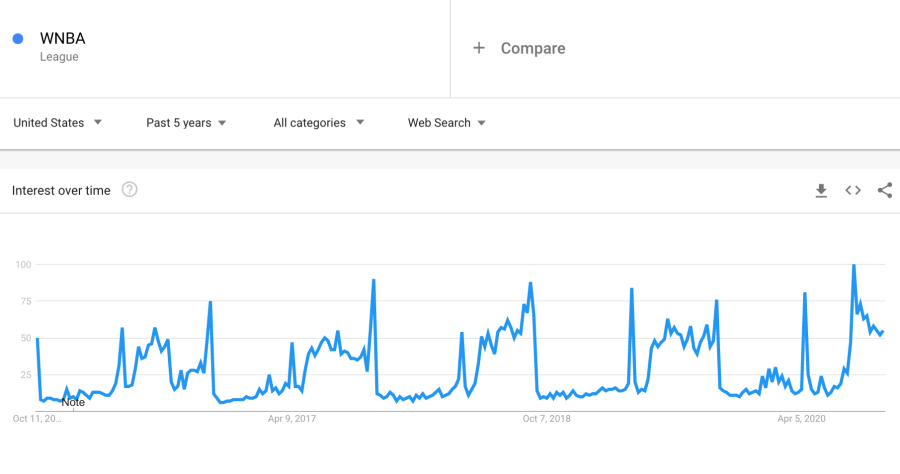
Of course, there was a pandemic, so more people might have been watching TV than ever before. But also, more competing sports’ seasons were on than ever before. So overall this feat can be recorded in the books as a big win. Even more encouragingly, opening weekend viewership was up 63% compared to the average game in the 2019 season reports GQ. And searches for the WNBA have been at an all-time high this year over a five year period, indicating increased brand awareness.
The new look for the WNBA is definitely a step forward. By being more inclusive with its Logowoman, as well as standing out with a bright pop of color, the league has shown it will not be ignored.
The biggest opportunity for the league continues to be further improving its marketing through strong distribution, original online content, and proactive fan engagement. They’ve got to spend money to make money. At the end of the day, a penny saved is only a penny saved. But a penny invested, can turn into many more dollars!
Up next, learn all about the game of one of the newcomers making a mark on the league, Rhyne Howard.
By the way, if you love the new look, you can get your Orange Hoodie here.